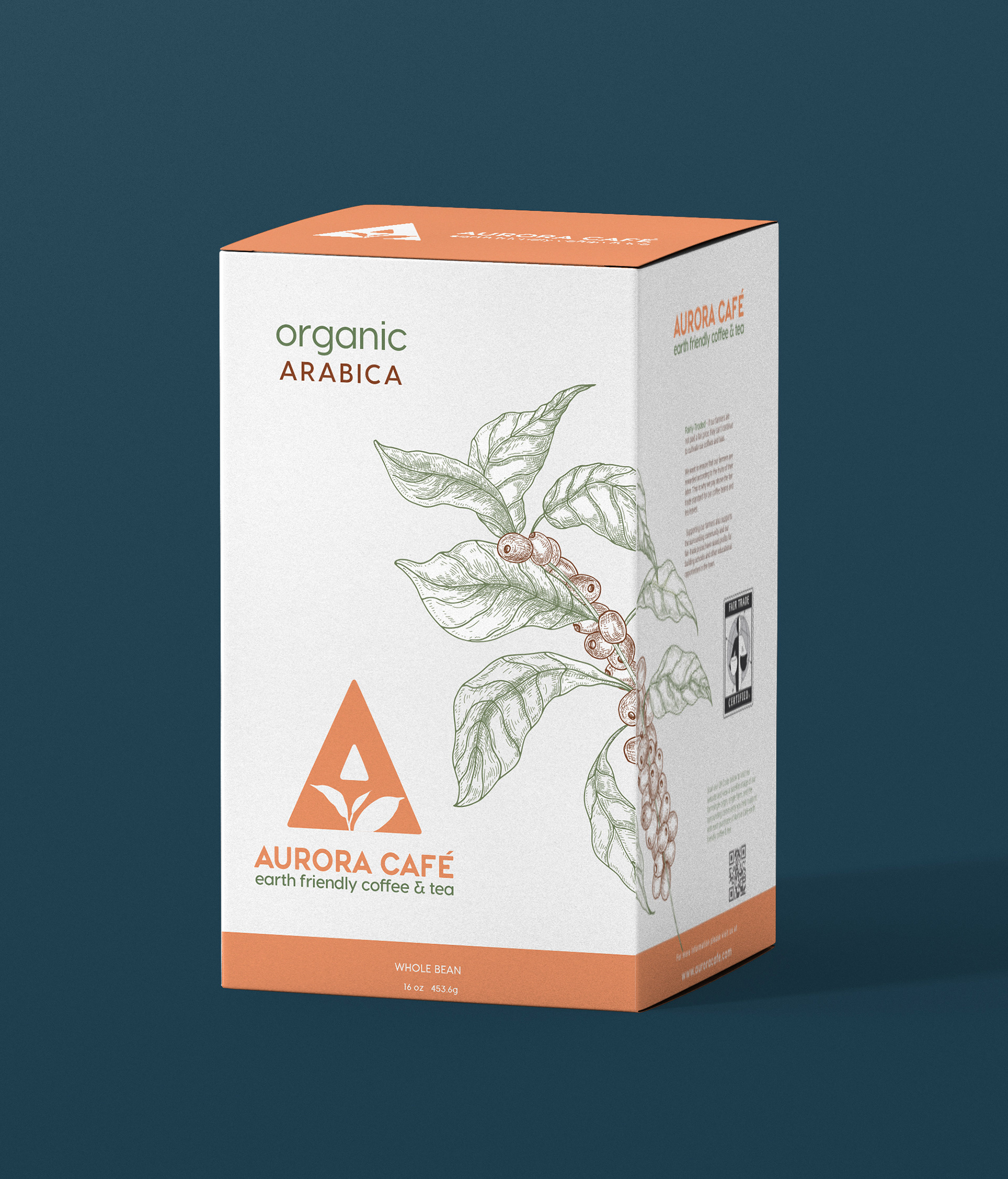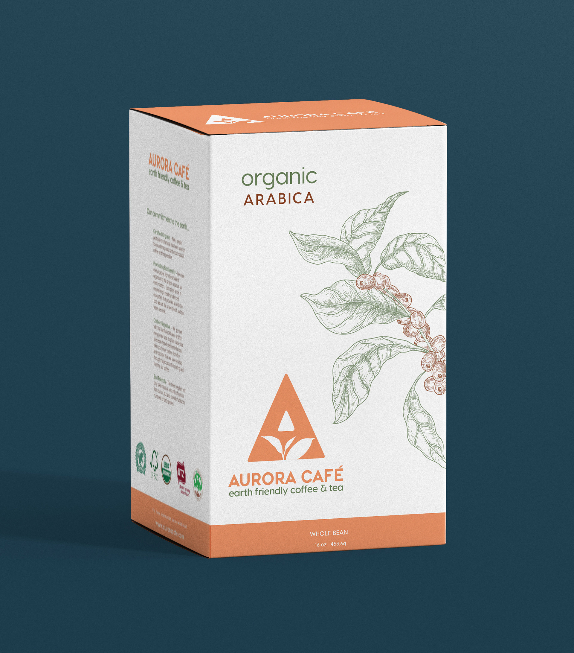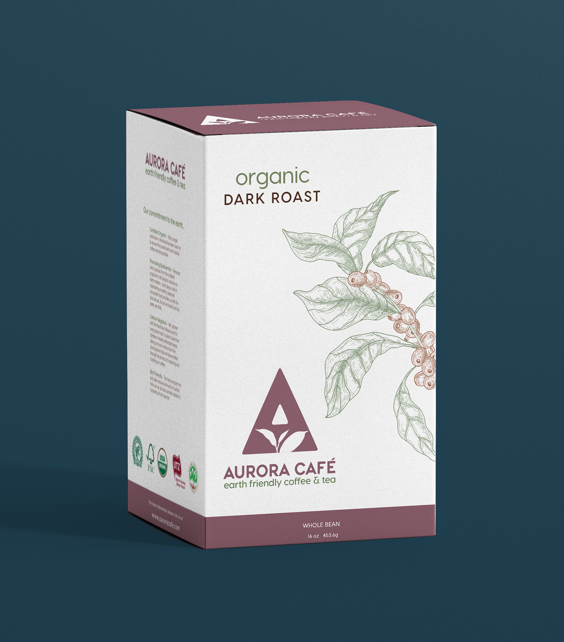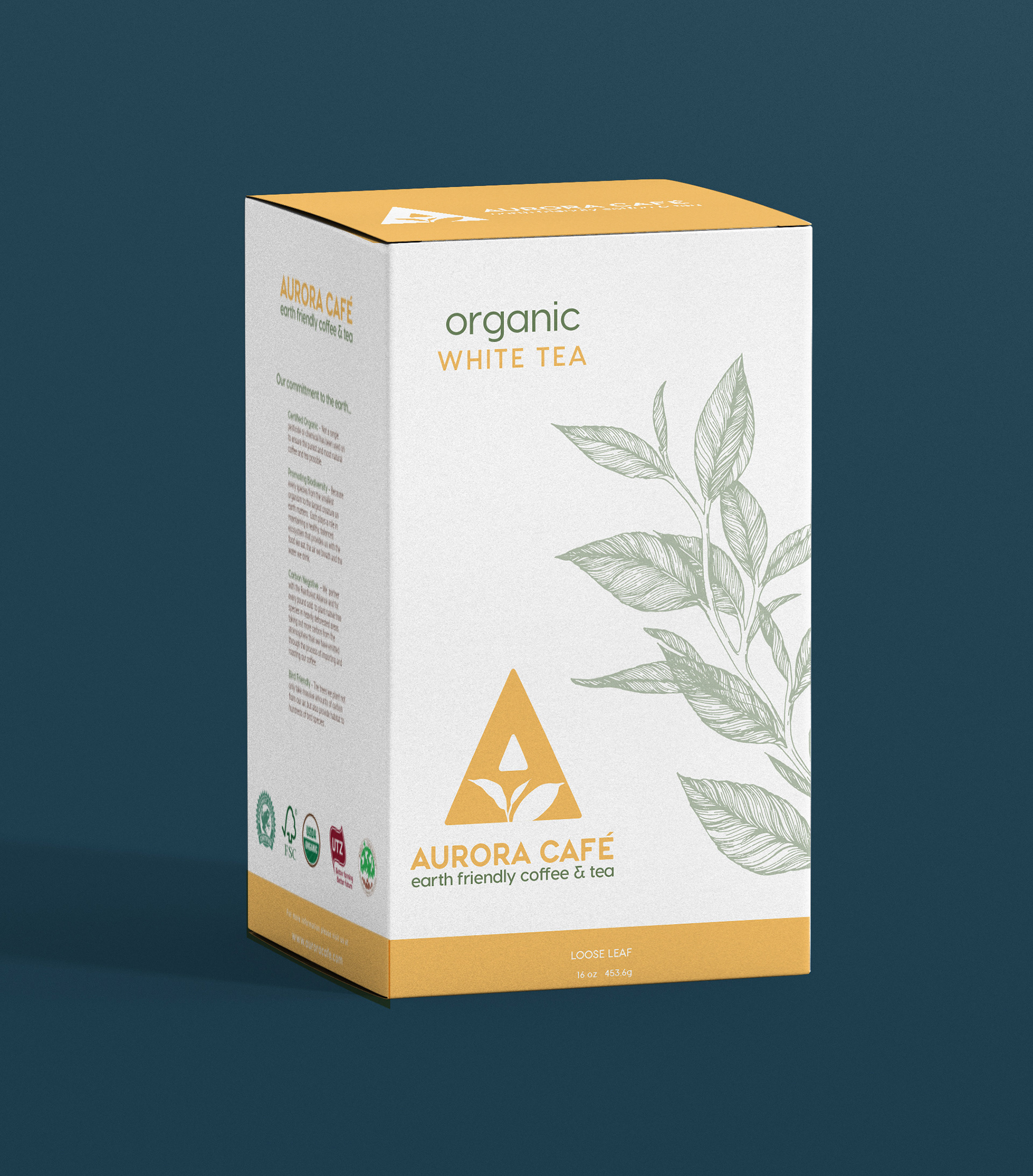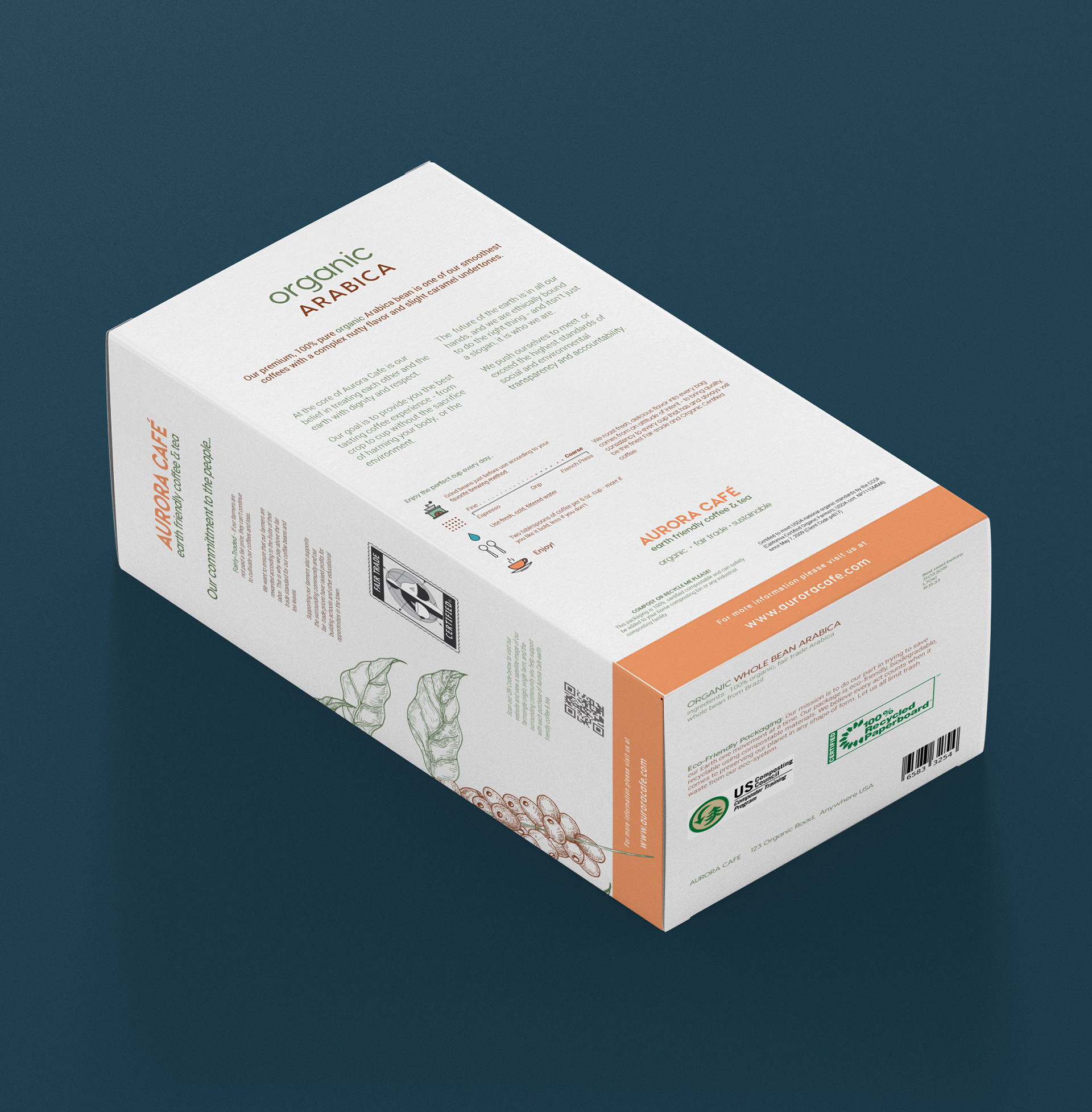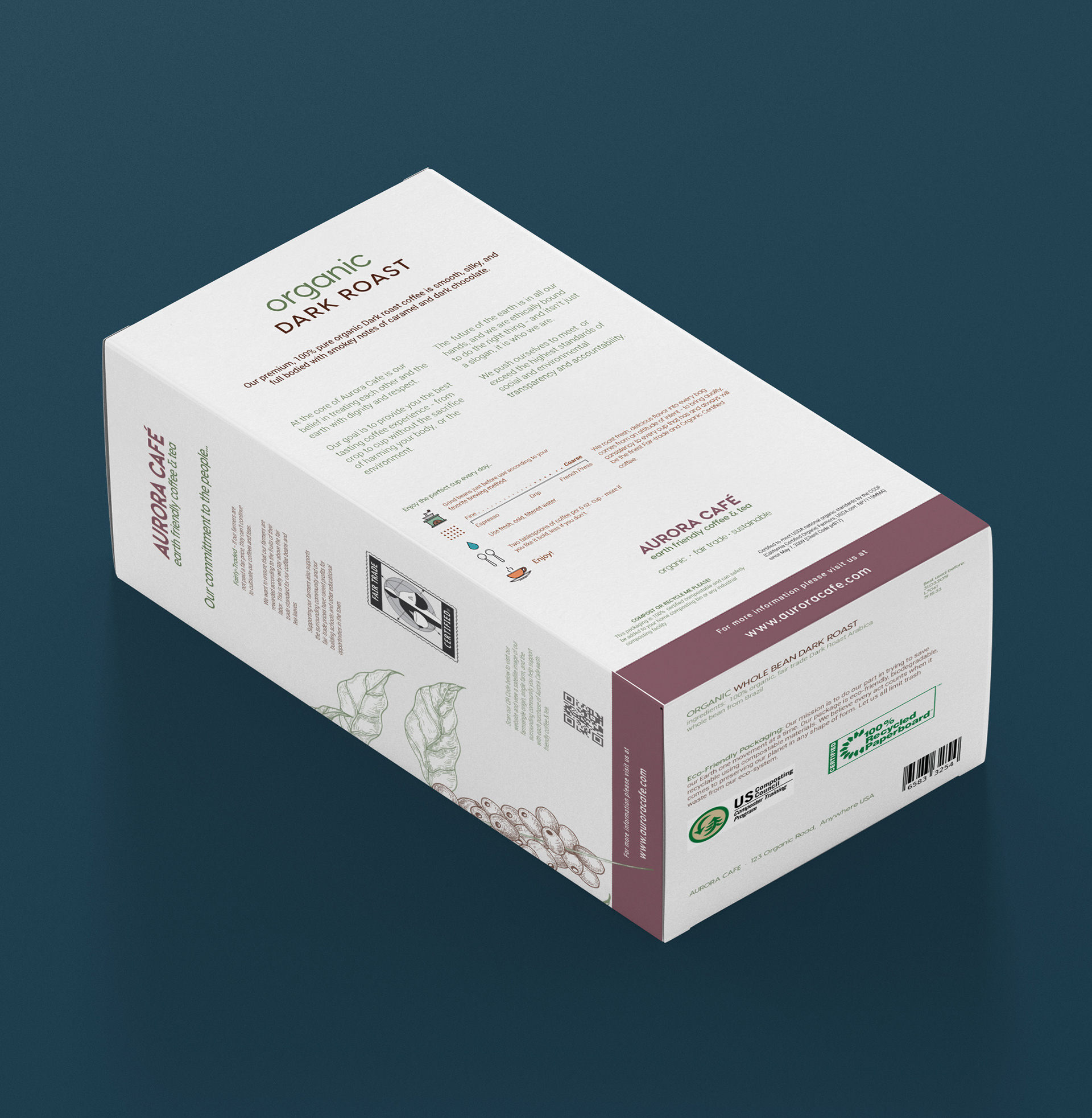
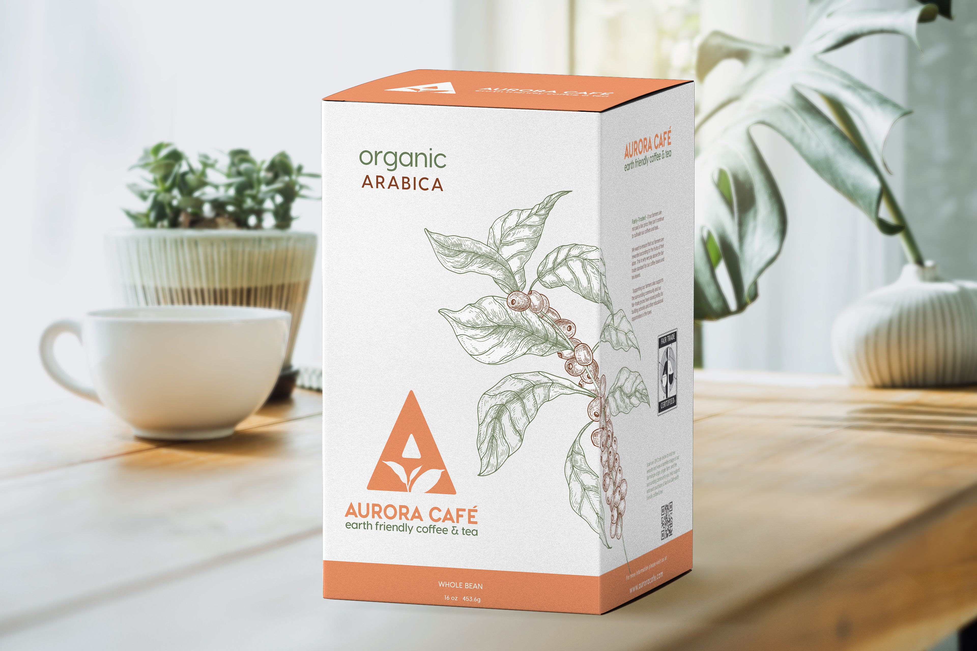
The bold logo and package color and imagery are thematic by product so they are easily recognizable on the shelf. The company's earth friendly mission is a strong USP, so that was the focus for the package and the text. Each panel on the box has a specific purpose - the back describes the coffee and the company, while the left side supports the fair trade ethic and the effects it has on community it is farmed in, and the other explains the earth friendly certifications and benefits to the environment. The coffee is illustrated with a coffee plant stalk, the tea with a tea plant. These illustrations wrap around the box which adds texture and movement creating a natural flow around the box - and the information.