

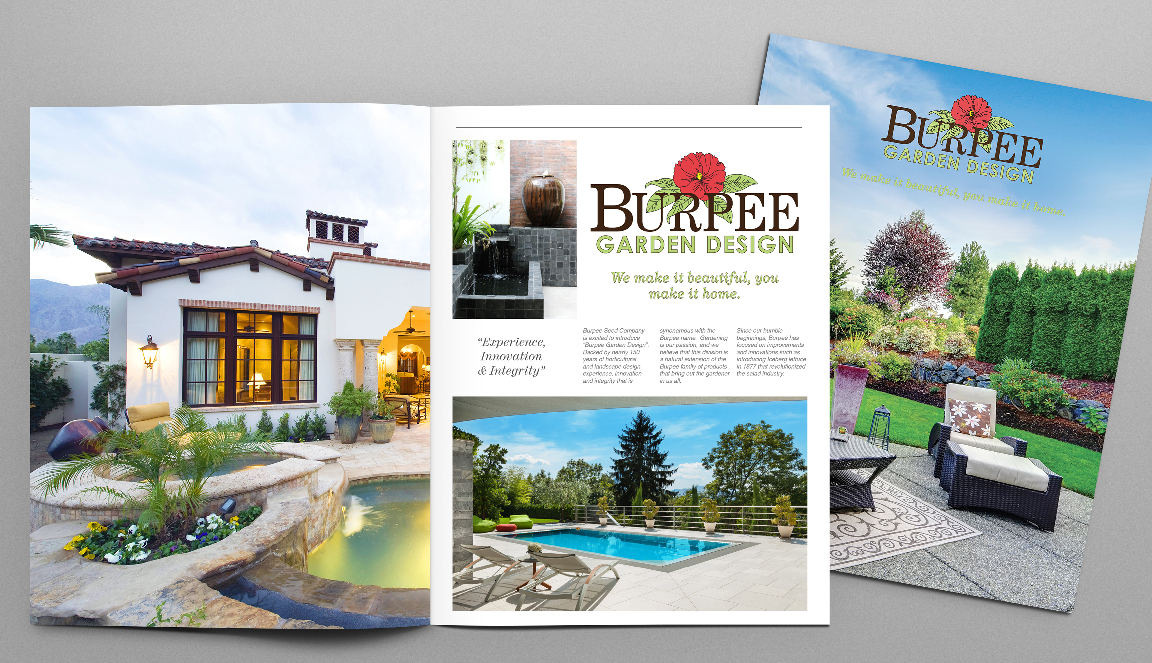
The web page article, images and layout was designed to remind the viewer of the company's history, and their view for the future. The header and footer remained the same for visual continuity. Each images was selected to represent the beauty and aesthetic of the new service while incorporating existing products. In writing the article I felt it was not only important to introduce the new product concept - but it was also important to remind the reader of the 150 history behind the ethic and reputation of the company.
Postcards can often be overlooked so it is important for it to stand out, while remaining cohesive within the campaign. I felt this image provided a vibrant burst of color that is bold and modern. I chose to maintain simplicity and let the image convey the emotion, while supporting it with the tagline, logo and website.